Monday, August 13, 2007

Safe SEX to YOUNG couples in Vietnam

I've found some meaningful websites about SAFE SEX for Young couples in general and for Vietnamese young couples in specific.

SAFE SEX FOR YOUNG COUPLES

Experiences from youths about safe sex


And here is my favorite part. After finding a lot of websites, I found great reasons why couples don't wear condoms :D

Shyness

  • Too shy to buy a condom.
  • Too shy to have a condom in her/his bag/room which can be see by parents/friends/fixed partner.
  • Too shy to ask to partner to wear condom during intercourse protocol.

Fears

  • Psychological fears induce by lack of sexual experience/maturity.
  • Fear that partner will leave if insisting too much on safety requirement. That fear is more severe in love context or financial precariousness.
  • Fear of temporary impotence that condom can induce.

Pleasures disturbance

  • "Less feeling".
  • "Delayed orgasm" of male.

Love

  • Love induce psychological blindness and fears which can induce dangerous atitudes
  • Love is also typicaly stronger in adolescence which is commonly associate with lack of experience.

Generalized intellectual disturbance

  • Lack of instruction. Unable to deal correctly with scientific information.
  • Natural lack of intellectual resources: poor IQ, mental diseases.
  • psychological diseases which induce wrong decision because unbalanced relation between "logical requirement" and "affective requirement" ...

Gaps in medical knowledge

  • Dangerous optimism regarding progress of medical sciences
  • Conviction that HIV is now curable disease
  • Under evaluation of treatment constraints

Alcohol, narcotics...

  • Alcohol.
  • Psycho stimulants ("extasy", "cocaine"... which are also use as erectile drugs)
  • Other narcotics. Can add another danger in the list of dangers induced by other drugs: the addiction! Addiction can drive to very dangerous behaviour ("wild prostitution"...)

Religions

  • Integrism and consecutive stigmas
  • Ethic and religion..

Fear of ethic corruption

  • Parents can fear that making condoms available to kids can corrupt them by inducing or encouraging sexual activities.
  • 02- Wives or "official partners" can fear that to put a condom in the pocket of partner can increase the risk or encourage extraconjugal relations.
For more information, you can visit the website: AIDS Prevention Pro

Sunday, August 12, 2007

Play with typography


When I walked around my friends' blogs, I saw this article which is using the text to display the image. It's really cool. Therefore, I decided to try one. Thanks Huong for posting this article.
http://s3153546.blogspot.com/2007/07/typography.html

It's not too difficult to to this type. There are many ways to do it.

I used the Lorem ipsum text(http://www.lipsum.com/) for the convenience.
1st of all, I changed your image saturation to -100, then controlled the level and curves when I think it was good in displaying black and white.
The easiest way I thought was making selection method.
After that, I changed the Brightness and contrast to have good effect.

Friday, August 10, 2007

Old style picture in Photoshop

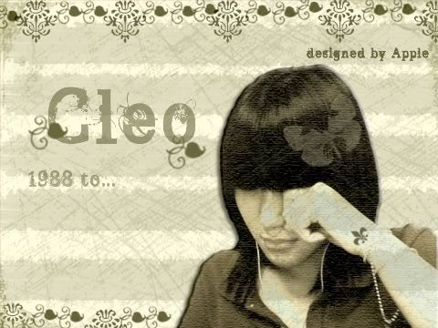
I made this picture for my little closed friend.
This is the first time I saw her crying. She has a Cleopatra hair style, therefore I decided to make an old style for this picture.The background was almost done by brushes.
I think this picture has a unity in color, font and designs.

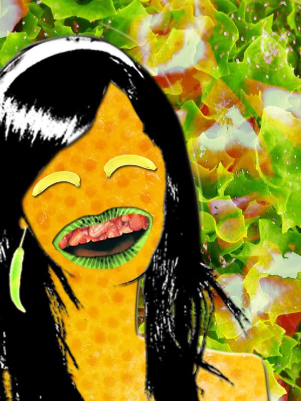
Portrait: A Vegetable girl


This is me, a vegetable girl ^_^

1st time, when I thought of what i would do for my portrait, I imagined they are ipod, laptop, headphone...modern stuffs that can show how mordern I am.

Therefore, when Maddy said all these things in class, it made me laugh at myself, lol. She knew my thought.

But yeahhh, she was right. Those things can just show who I want to be , what I want to have. Actually, it's not me :D

Then I started to think of what I have right now, on my face, what my habits are, how I live day by day...
I'm a girl, long hair, eating much,smiling all the time, confident and bla bla bla
Then I thought of what can represent these things for me
...yeahhh, it's vegetable and fruits. They can show how much fresh my age is, how much food I eat, how much colorful I put on myself.
There should be a key thing that make people remember me at the 1st sight.
...ohh well, it is my lip, hahaha.
I hate my lip because it's not attractive as I want(Jessica Alba for example, lol) T_T
...but I love it because people love me by my all the time smiling mouth, ho ho.

Monday, July 30, 2007

Poster for game


This is a poster a game tournament so I want to make it look colorful but not too much, that's why I used different levels of orange color. I also used cute fonts, like fonts for cartoon.
The black color create the magic feeling of the game. The poster is arranged horizontally by the text, just those arrows are vertical.
The poster focuses on the balance although the Cash flow logo has a bit dominance.

Friday, July 27, 2007

Title of movies(updated)


The Gone with the wind title was so bad then I tried another one.
As I was learned yesterday, I used 2 fonts for the title. I arranged the positions of these words many times but just felt ok for this.
I looked at this font : Edwardian Script ITC , and recognized that all letters connect together, it made me think of the link for letter E and D

Wednesday, July 25, 2007

Title of movies


It's quite funny when I just need 10 minutes to edit the font follow the title of The Lord of the rings but I did spent 20 minutes before to find the similar fonts by identifont.com. Because the title just contents 12 letters, it's hard to identify, then I just click"not sure " all the time, lol.

Here are some fonts that I found:

CR Cartier
Agfa Rotos Semi_serift
ITC Souvenir
Daily News BQ
Photina
Arnhem

I chose the font ITC Souvenir that is available on Illustration. The only difficulty is to make the text smooth.


I also tried another title "Gone with the wind". It has 2 main words Gone and Wind then I resized them. I wanted to create the balance too, therefore I make the G and the D bigger than the others. Rage Italic is chosen because it has the soft and the wave style of the wind.